Responsive Web Design
The best way to discover what a responsive website does? Play! You can try it out using your browser window and other web-enabled devices, like iPhones, Android handsets, tablet computers, netbooks – the list is growing all the time.
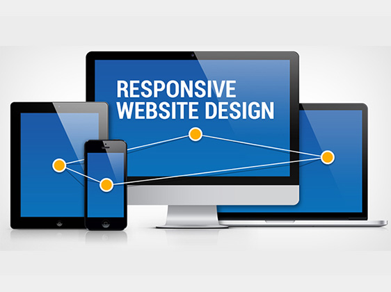
Our responsive web design services enable you to put all your resources into the optimization and maintenance of one single website. Responsive web design considers the many dimensions in the context of use: from desktops to laptops, tablets, and smartphones to tablets. We make your content easily accessible wherever your users are. As you change the size of your browser window, you’ll notice columns collapsing into single paragraphs or breaking into multiple columns. Images will reduce in size and grids of thumbnails will adjust themselves to comfortably fill a new screen size – or disappear altogether.